Golden Harvest
Retail
From a traditional family bakery in Floriana back in 1946 to a state-of-the-art facility, Golden Harvest has always been at the forefront of the Maltese bread industry. Having a history dating more than half a century, the company’s vision was to re-visit its visual identity while remaining true to the heritage that made it what it is today.
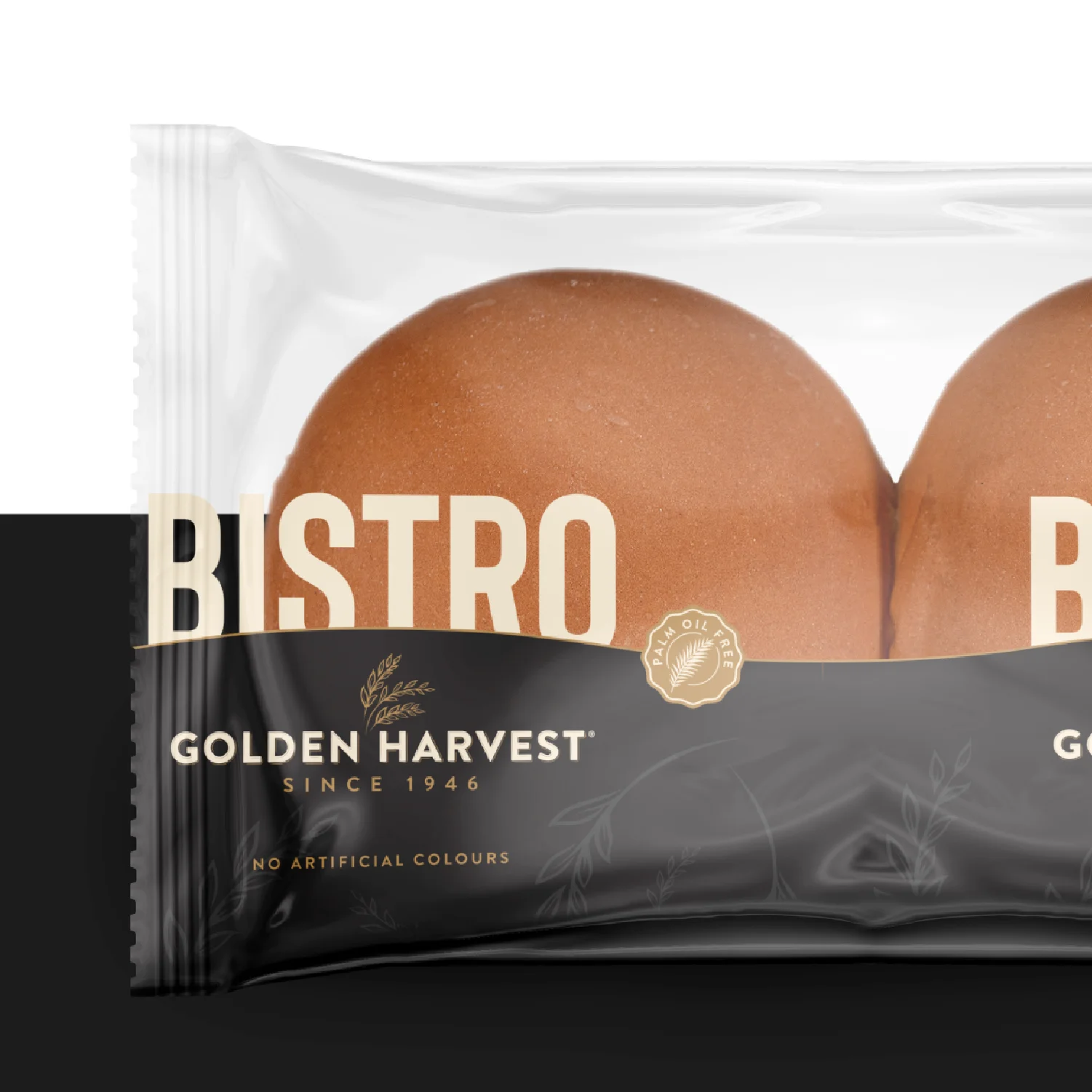
Slowly through the years, Golden Harvest have continued to bring their various products visually in-line with the new brand direction, with a vision of holistically upgrading its entire look & feel over a medium-term period.
Challenge
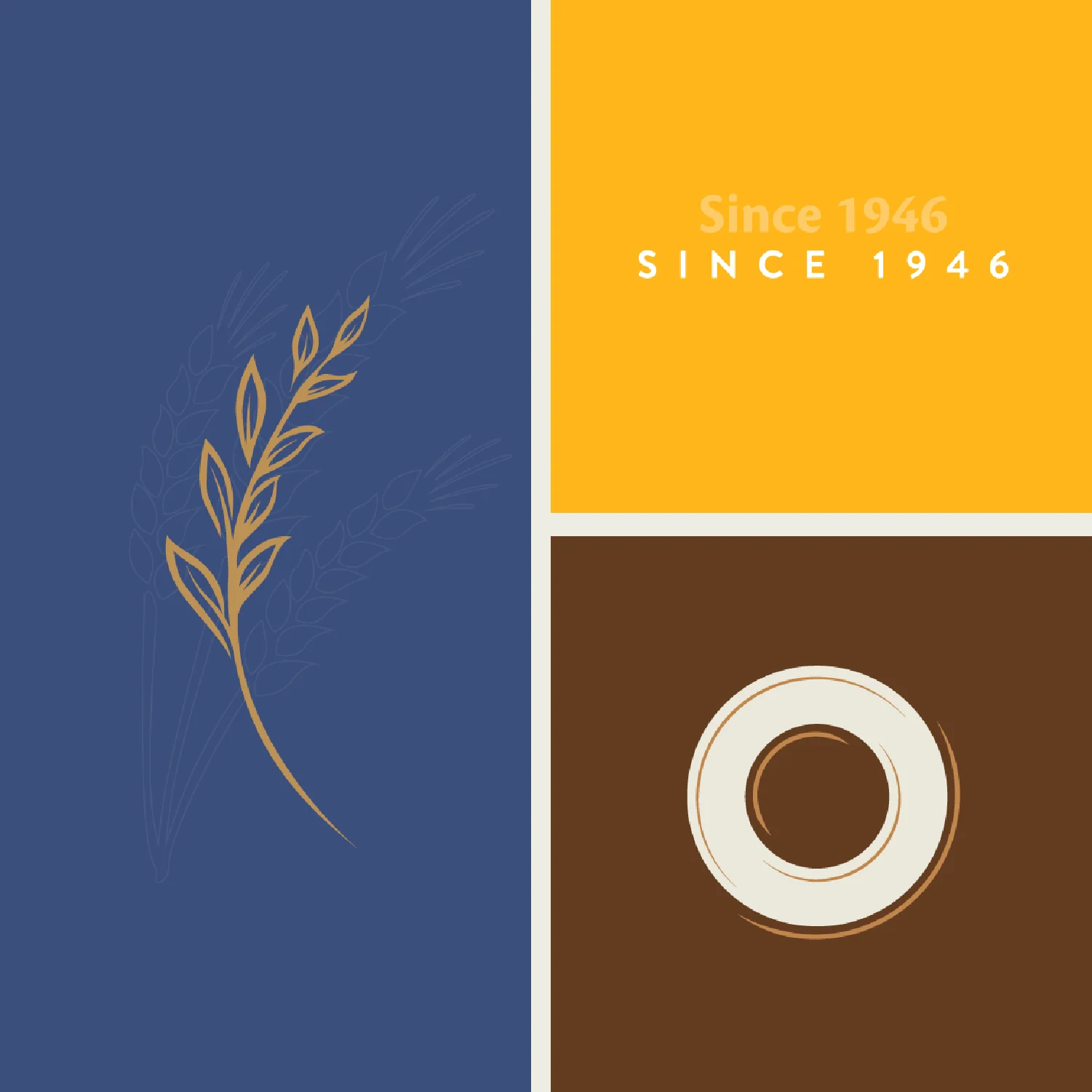
In our collaboration with Golden Harvest we were entrusted with kick-starting the process of re-inventing the company’s visual presence and give the brand an overall modern refresh. We started the process by re-visiting the Golden Harvest logo. The essence of the logo was kept in place but improvements were done in its mark and typography, keeping it immediately recognisable while still making it ready for the future.
Our Contribution
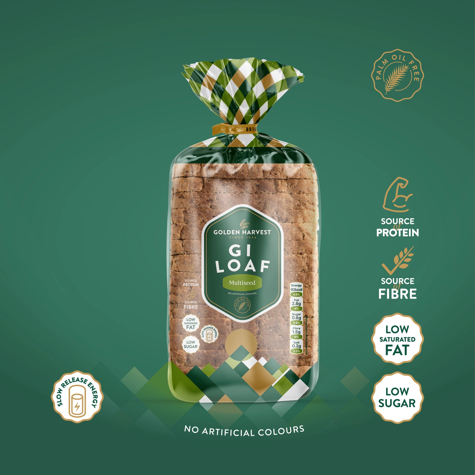
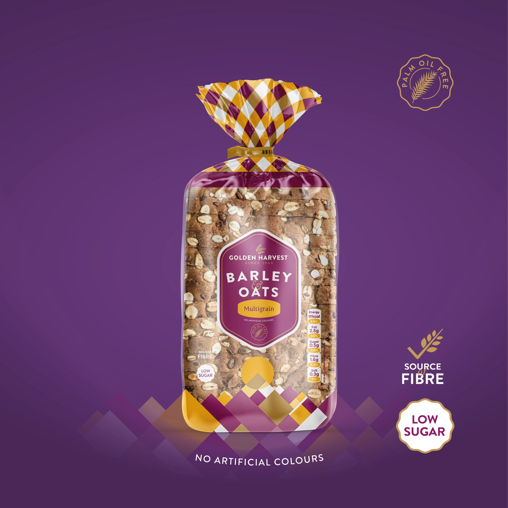
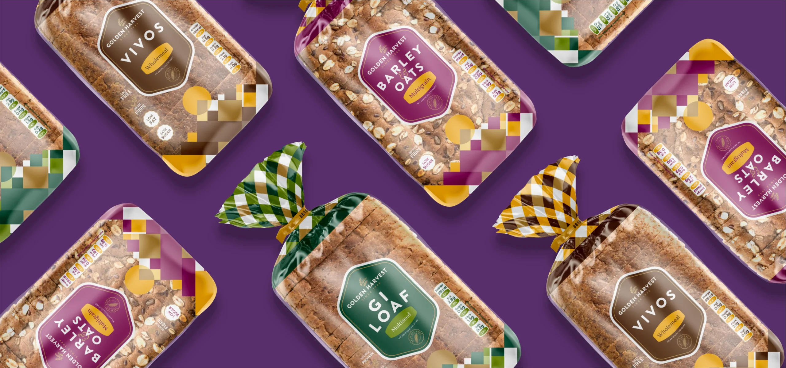
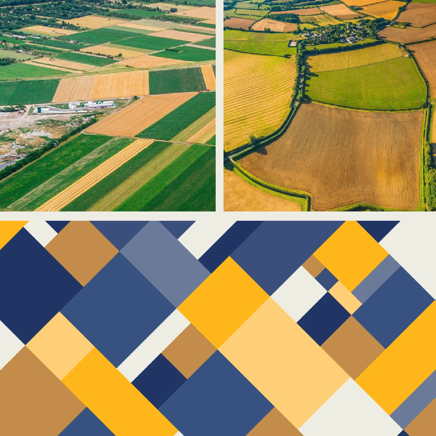
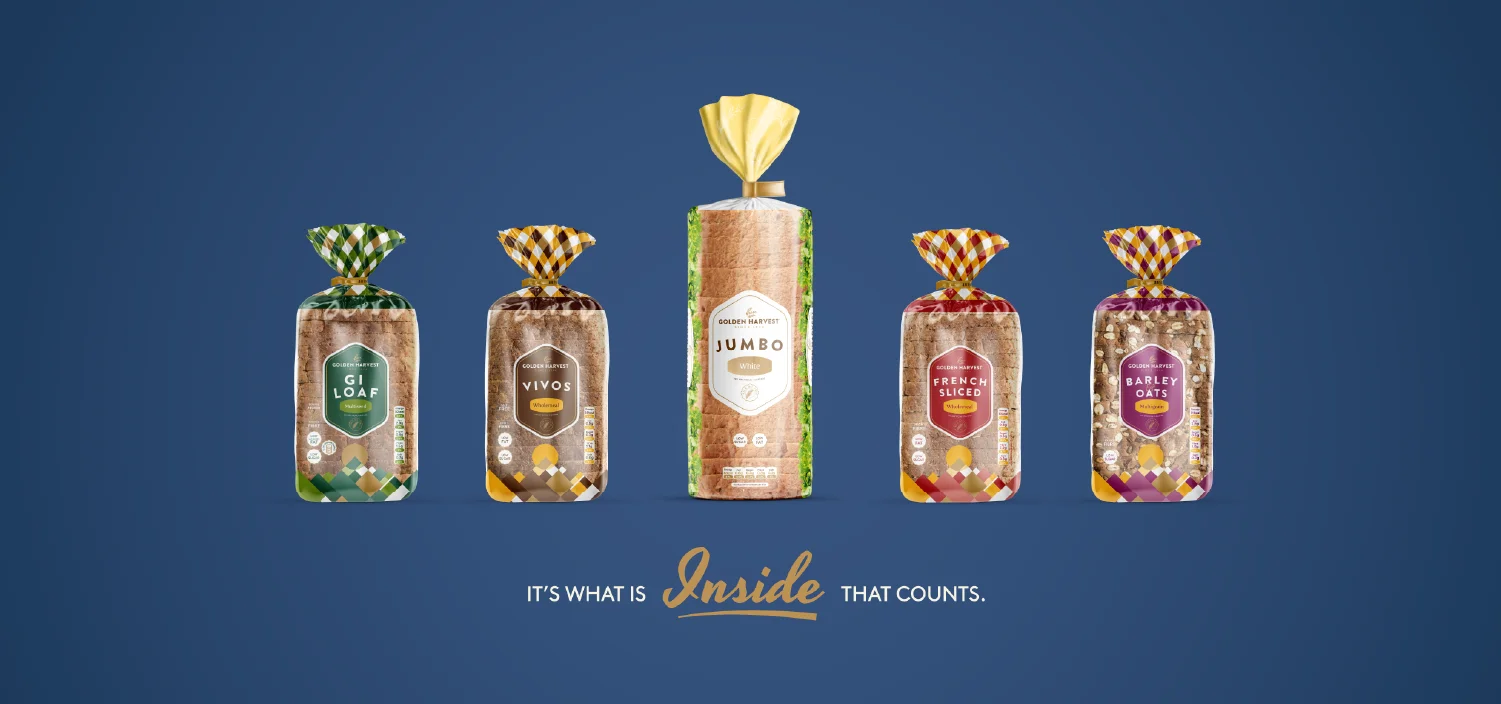
The following step in the process was the re-invention of Golden Harvest’s staple product, the sliced bread. Aimed to increase the visible exposed area that shows more of the actual product, the exercise consolidated the design patterns, while also coming up with a new unique identifiable feature. This unique pattern which was developed, took inspiration from aerial photos of multicoloured fields. A system of 2 colour + gold was adopted for all the pack colour variations which brand the company’s whole range of sliced bread.
Value Given
In collaboration with Golden Harvest, we successfully preserved and evolved their brand identity to align with their new brand direction. Throughout this process, we maintained the essence of the brand while ensuring it was adaptable for the future. This strategic approach enabled us to modernise Golden Harvest's identity while staying true to its core values and uniqueness.
